Sophie Majecki
Work
Work
Work
UX Designer
Currently working at Ipsen and previously at Orange, XDLab Studio, I have collaborated with incredibly talented people across different companies and countries.

Ipsen.com
2019
Redesign of all the corporate websites. How to create a better experience and answer to all the different needs of our users.
My role
UX Design Lead - Interface Design
To understand...
I worked on the redesign of all the corporate websites of the group. It included the global Ipsen website in English/French versions and the 22 country versions. The target audience for this corporate website was: patients, HCPs, investors, talents, partners and media.
We tried to solve different problems related to the last website version. Ipsen was looking to consolidate and streamline the global platform to provide a greater user experience engagement by improving biotech company image, customer experience, building new interactions, harmonise& expand the Ipsen's global visibility.
The alignment across the platforms was a critical point to have a clear identity shown. Also, a clear change to increase the level of interaction was important as we were limited only to a contact form.
The expectation was on the design and user experience effort.
We established different work teams for this big project and I was in charge of the design for Ipsen inside the design workstream, validating and exchanging with an agency for improvements.
Start of the project: defining the problem
At this stage, we made a full defined list of scope, including acceptance criteria and defined measures of success for the project with the team. Through research and deep understanding of both users and business needs, we looked for insights and breakthroughs that helped us identify what to focus on.
We highlighted some problems and realised that 90% of the investments will be going into the build phase as: most sites were not updated, the impact of local websites were very low, regional/global ones drive 90% of the traffic, content updates were not implemented locally and there was no harmonised look & feel of the websites.
Overall, the online presence was very poor and the user experience needed to be unified across all the platforms. We were working on the corporate website in the objectives to merge the existing fourth ones: Ipsen.com, Ipsen.us, Ipsen.talent and Ipsen.com affiliates.
The Sitemap
About the global remarks about all the platform sitemaps, local menus were displayed in many different ways: dropdown, list of links, list of teasers, ...). The order of pages in menus differed, depending on where the menu was shown with which component.
The sitemap page on the global website did not match 100% the real available webpages. Also, the EN and FR language versions of the corporate website were identical in the navigation structure and sitemap.
Lots of pages had lengthy texts, possibility why the font was so small, tabbed browsing was actually a 3nrd level navigation, dropped in the middle of a page, there was no breadcrumbs and proportions of components were nuisible to a good navigation.
All those remarks have been made by analysing the corporate websites below.
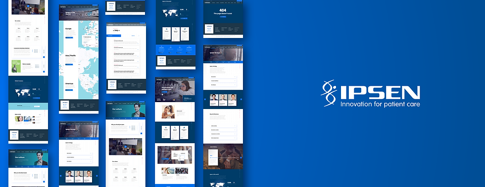
Global Corporate websites to redesign
Analysing the needs
Personas
The use of personas and customer journeys helped to map out and test the information architecture prior to code development to test and refine the experience.
Most of the personae have been made from secondary
research about users behaviours in Europe and the US, with the main difference being access to product information.
We referred to them throughout the entire product development process with a clear idea of our user's needs. The personas have been completed with a short presentation and focusing on their objectives, needs, pain points and habits.
It was precious to have that information in mind for the ideation phase while defining and prioritising the features and navigation.
Customer journey Mapping
We mapped out the customer's journey to see how we could simplify their journey to help them reach their most important needs and objectives with our websites.
Customer journey maps were based on secondary research and feedback from semi-structured interviews.
We decided to use this method to have the full details of the user journey by mapping all actions and see their objectives, motivations and feelings. In this way, to help to focus on their journey with a dynamic dimension by highlighting problems and good aspects of their experience.
User Stories
We created user stories from personas to map out the users's steps to understand the viability of our solutions when framed from the perspective of our users.
We decided to use this method to have the full details of the user goals by mapping all the needs from each profile. It was mainly to help to keep products user-focused and help prevent feature creep and design dead-ends to promote cooperation between team members.
The UX Design strategy
After all those analyses, we decided to use the Atomic design method to create tools based on modular components, leveraging a clear information hierarchy and a natural design approach. By building this componentized structure, we reinforced information pathways and created predictive solutions that audiences found simple to engage with.
The purpose of atomic design in this project was to distil interfaces down to their core components - focusing on simplicity and restraint - results in reduced cognitive burden and happier users. Also, to use progressive disclosure to allow content to be presented in a concise visually appealing way. And finally, to focus on re-using elements and minimising visual complexity while a user with micro-interactions micro animations
About the global sitemap, the next improvements were with the drop of lengthy texts (as the text is not going to be changed), to combined multiple pages in one-pagers with sections, to improved how people will know how to scroll. The choice to make one-pagers allowed for a better storytelling, and the use of a sticky bar navigation to browse through a long page, subtle animations during scrolling can create a delightful experience with the user. Also, to have anchor links in the page to help the user to know where they are positioned in the page.
All the pages content were going to be in a one-pager, some pages will be merged and components created to optimise the content lectures and reduced the most possible additional pages.
Content mapping and strategy
Content priorization
The corporate platform content was analysed page by page in order to prioritize it and its navigation. For each page, analyses were done by heatmaps and tracking the navigation of our users.
Charts were made and from that, we were able to build a strategy regarding our user and keep the most relevant content for our users based on Google Analytics figures.
New pages proposition
After doing a content audit of all the pages and navigation frequency, a mapping was made before the wireframing. Each pages were restructured regarding the information we had from the previous analysis.
This step helped to validate it with the communication and legal department, content strategy has been established for each page.
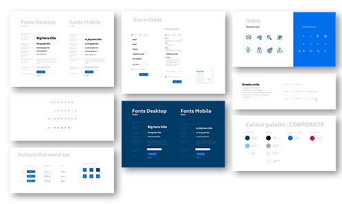
Visual design: Atomic Design


