Sophie Majecki
Work
Work
Work
UX Designer
Currently working at Ipsen and previously at Orange, XDLab Studio, I have collaborated with incredibly talented people across different companies and countries.
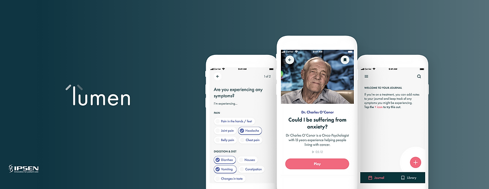
Lumen – Healthcare app concept and UX Exploration for patients
2019
Lumen is a daily guide app to support quality of life, for patients with advanced renal cell carcinoma cancer.
My role
Design Research - UX Design - Interface Design
To understand...
Lumen is a project focusing on how to increase patient's quality of life, increasing life expectancy and add value above medical solutions. The idea was to help patients with RCC by recommending them holistic, supportive (community/key opinion leader) content in response to treatment impacting on their quality of life and make them able reporting their daily symptoms.
The final users are patients with advanced renal carcinoma cancer. Ipsen objectives were to create a Digital Therapeutics solution to be used as a daily guide for patients on 1L/2L treatment. The challenge was to understand their essential needs having in mind that their conditions and specificities, at this stage could have a huge impact on the acceptance of the product.
The purpose of this app was mainly to understand what drives a patient's quality of life (with potential implications of Cabometyx), Identifying which support has the biggest impact on a patient's QoL and identifying the impact of different treatments for a better management of their conditions and improvement of their life.
My role was as a UX Designer, I did research, workshops but also designed app interfaces, wireframes to prototype, working closely with a digital agency. To establish this first version, a product design sprints was made with the agency to create a first version based on user research made in different countries, medical studies, a benchmark for a solution to be tested with Australian patients.
Start of the research
3
Design sprint weeks
3
Countries
Involved
(Spain, Germany and Australia)
9
Interviews
(With HCPs and RCC patients)
5
Usability
Testing
(With patient association in Australia)
2
Personae
(Based on Spanish and German patients)
Competitive research
After doing a benchmark study, we noticed that some concepts and interactions were quite successful amongst the patients community.
Users were looking at being able to find supplement information on their disease (shared experiences, side effects of a drug, explanation around the disease or treatment, HCPs feedback,...).
Around the community perspective, exchanges and chats were successful, mostly when build around a specific topic or questions (Emotional support, advice on specific situations, forums, ...).
Overall, habits around the uses of apps are increasing towards the building a community and search for reliable information. It demonstrated to us that those two elements are quite important for patients. Also, it was features we have found in most of all health and self-awareness digital solutions many times.
Interviews
Deep user research with 9 patients and HCPs in Spain, Germany and Australia were conducted. Those interviews were about having a better understanding of the user with qualitative feedback and some verbatim. The key to this research was to understand what drives patients quality of life and identify which support will have the biggest impact on patients quality of life.
The interviews were semi-structured and on 3 main parts: First, based on questions about the background context (professional life, family, activities and overall how they manage to relax), plus their approach with technology. The second part was about their RCC journey and their healthcare experience.
Then, their day to day living with the disease, before and after and what are they doing daily.
Also, with some open questions as "what has changed in your life?" and recommendations in our projects from their point of view.
The results of this research were that patients with RCC have a lack of holistic support, empathy and human connections. While the side effect management is important to them in "optimising" their quality of life, it is very much a secondary need against the unmet social and psychological needs that are affecting their quality of life.
"This is a disease that can affect you very much psychologically. I see my HCP once a month." Santi, 70, Germany.
"Out of 100 things on the internet, 98 aren't true, I haven't found a website I trust more than my oncologist." Ricardo, 51, Spain.
"Every 20 days I have to fill in a very long survey.
I've been very lucky with my doctors. They've never explained the drugs to me and I don't really care, I'd rather not know." Amadeu, 78, Germany.
Analysing the needs
Personas

Based on the Spain and Germany interviews and the study from an institute medical research, two primary personas have been set up. We referred to them throughout the entire product development process with a clear idea of our user's needs.
Those personas were helpful to identify the different profile group of our users and differences between the two countries. The personas have been completed with verbatim and short presentation (name, age, pictures, context related to the user), objectives, needs, pain points, habits.
It was precious to have that information in mind for the ideation phase while defining and prioritising the features and aesthetic of the app.
User Journey

The users's steps have been mapped out to see how to simplify their journey, to help them reach their most important goals with our product.
Customer journey maps were based on the medical study, feedback from semi-structured interviews and personas. It shows goals and steps by analysing the frequency in their feedback.
This method allowed us to have the full details of the user journey by mapping all actions and see their objectives, motivations and feelings.
It was mainly to help focusing on their journey with a dynamic dimension by highlighting problems and good aspects of their experience.
Ideation phase
How Might We...

How Might We question helped by reframing challenges and insight statements into opportunities for innovative solutions.
This format suggested that a solution is possible and offer chances to answer them in a variety of ways. It was about defining themes and insights on identified problems that pose challenges to the patients we were designing for.
This method doesn’t suggest a particular solution but gives the perfect frame for innovative thinking, it was very helpful during all the ideation process for not going away from our principal statements.
Crazy 8, Google Design Sprint

It is during this phase that the features to be tested and develop into wireframes have been founded. With the team, we brainstormed using the Crazy 8 method from Google Venture to find out about features keeping in mind the statements during the previous HMW workshop.
During this workshop, we exchanged about our ideas and I thought about creating content in podcast format for patients. Other features we found by the team as:
- daily track of side effects,
- the possibility to have a look to symptoms with charts and data visualizations,
- to access to a chat group, to exchange with community/key opinion leader and a community area with meet-ups,
- forum and support groups.
-Podcast content
Wireframe&Mockups: Final phase before testing
After gathering and analysing all the feedback, creating features, navigation and brand identity,
design of the final screens were made in a neutral visual style.
Usability: Testing with patients

This usability test was done at the end of the project when the prototype and its features were developed. The test has been done with 5 patients in Australia. Each features and pages were tested with the patients to have their feedback in terms of usability but also acceptance of the features and interest to them.
It was a remote testing moderated and recorded, all the feedback were gathered into a table with four categories:
-What were the things they liked, found confusing, didn't like and ideas/suggestions they might have with pages they interacted with.
With those feedback from our users, we have had to review the app. Its aesthetic was not accessible enough and we decided to develop the most positive feedback features, the podcast and side effects reporting.
"I enjoy listening to podcasts and find them easy to listen to." Sharon, 47, Australia.
"If someone wants a step by step process for side effects management then this is good. I like the idea of podcasts and Forums (in the app)." Garry, 61, Australia.
"I like the idea of podcasts and I am interested by the side effects management." Kirsten, 48, Australia.
Final UI Design


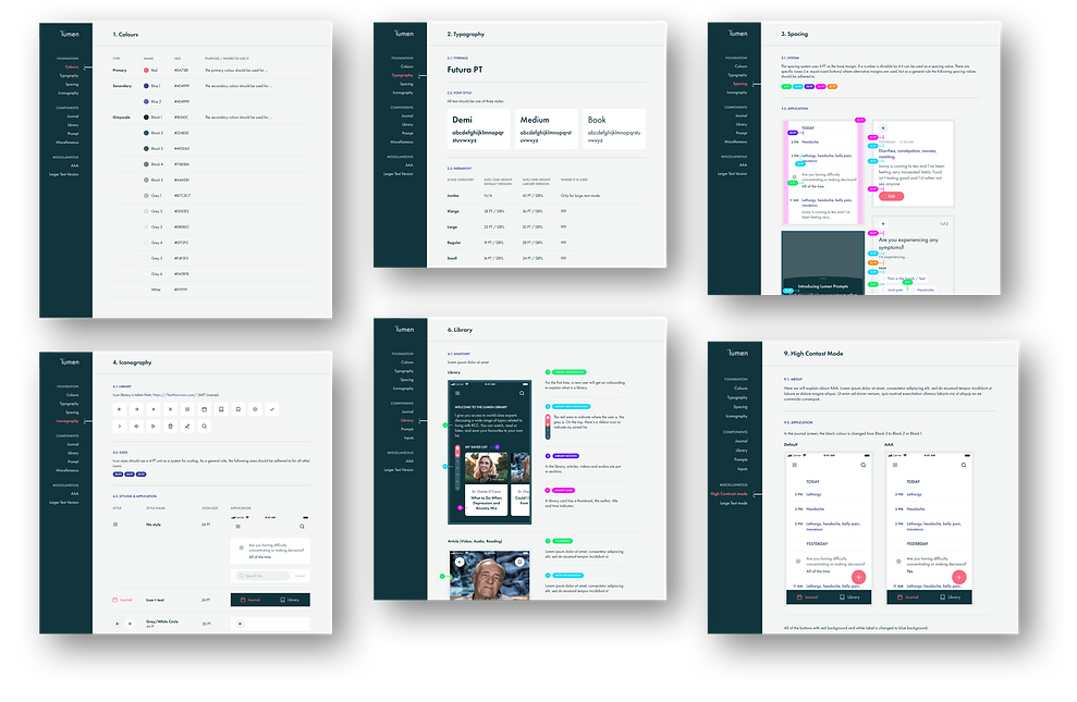
Design Library
A design library have been created with guidelines about the use of the typography, spacing, colours, iconography. Also, on the use of UI components and interactions and finally a reminder about the accessibility guidelines, specific use of typography and colours.